Best Colors to Wear for Colorado Family Photos in Every Season
Color tells a story before anyone says a word.
The deep green of a dress against red rock. Cream and rust in a field of golden grass. Burgundy and navy under a sky heavy with autumn light. What you wear becomes part of the photograph, not just how you look, but how the image feels.
In Colorado, the landscape changes dramatically with the seasons. The mountains shift from wildflower meadows to golden aspens to snow-covered peaks. The grasses go from green to gold to brown. The light softens, warms, cools. And the colors that photograph beautifully in July aren't the same ones that work in October or February.
This guide breaks it all down, season by season, location by location. By the end, you'll know exactly which colors will make your family shine against whatever Colorado backdrop we choose.
And if you want personalized help, I offer wardrobe styling guidance to all my clients. Let's build your palette together.
How color works in photographs
Before we get into specifics, it helps to understand why color matters so much.
Complementary colors pop. Colors opposite each other on the color wheel, like blue and orange, or green and red, create visual contrast. This is why a deep green dress looks stunning against red rocks, or why rust tones glow in a field of golden grass.
Similar colors blend. If you wear tan in a tan field, you'll disappear. If you wear orange at Garden of the Gods, you'll become part of the rock. Sometimes that's beautiful. Usually, you want a little separation.
The landscape sets the palette. I always think about where we're shooting when I help clients choose colors. The environment isn't a backdrop, it's a participant.
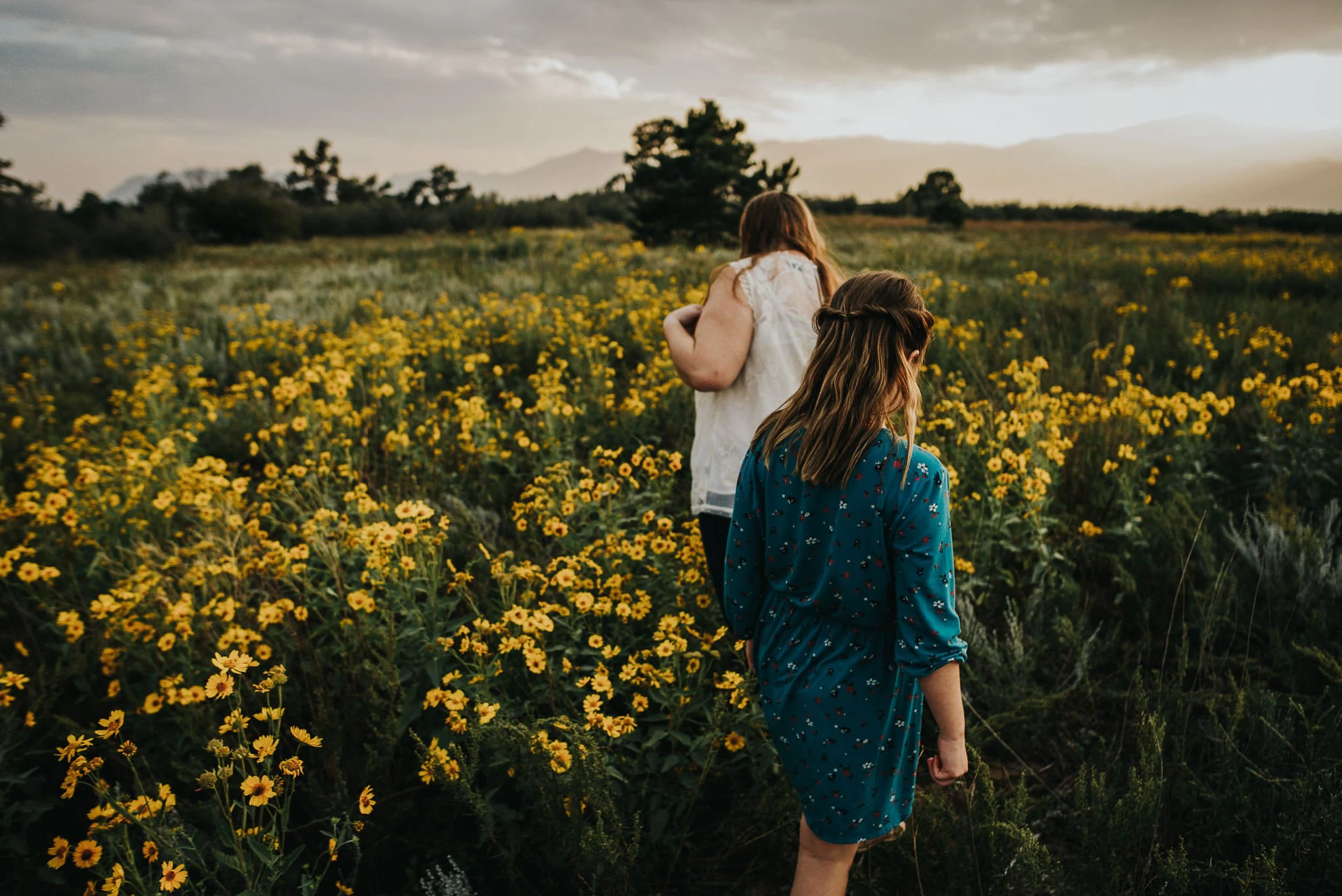
Spring in Colorado
Spring in Colorado is unpredictable. You might get wildflowers or mud. Sunshine or a late snowstorm. But when spring shows up, it's soft and fresh, new green grasses, early wildflowers, cool blue skies.
Best spring colors
Deep greens — forest, emerald, olive
Dusty rose — soft but grounded
Ivory and cream — clean and timeless
Dusty blue — mirrors the sky, works beautifully in green spaces
Plum and mauve — unexpected, beautiful
Warm neutrals — tan, taupe, oatmeal
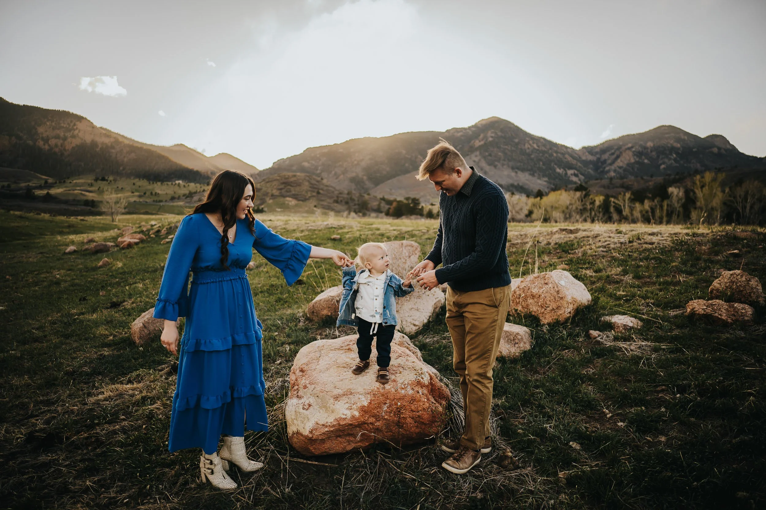
Spring palette example
Forest green dress (mom), cream sweater and tan pants (dad), dusty rose dress (daughter), ivory onesie (baby)
What to avoid in spring
Heavy, dark colors that feel wintery
Bright pastels that look like Easter eggs
Neon anything
Bright white, cream photographs better
Summer in Colorado
Summer is golden hour magic. Long evenings, warm light, green meadows in the valleys, wildflowers in the high country. The light is rich and warm, and deeper colors look stunning in it.
Best summer colors
Warm earth tones — rust, terracotta, mustard, burnt orange
Deep greens — emerald, forest, hunter
Cream and ivory — always a safe choice
Dusty blue and navy — cool tones that balance warm light
Burgundy — rich, unexpected for summer, photographs beautifully
Plum — another deeper option that works year-round
Summer palette example
Terracotta dress (mom), navy button-down and tan pants (dad), cream romper (daughter), mustard suspenders with ivory shirt (son)
What to avoid in summer
Neon colors that clash with natural tones
All black, it absorbs light and can look heavy
Bright white in direct sun, overexposure risk
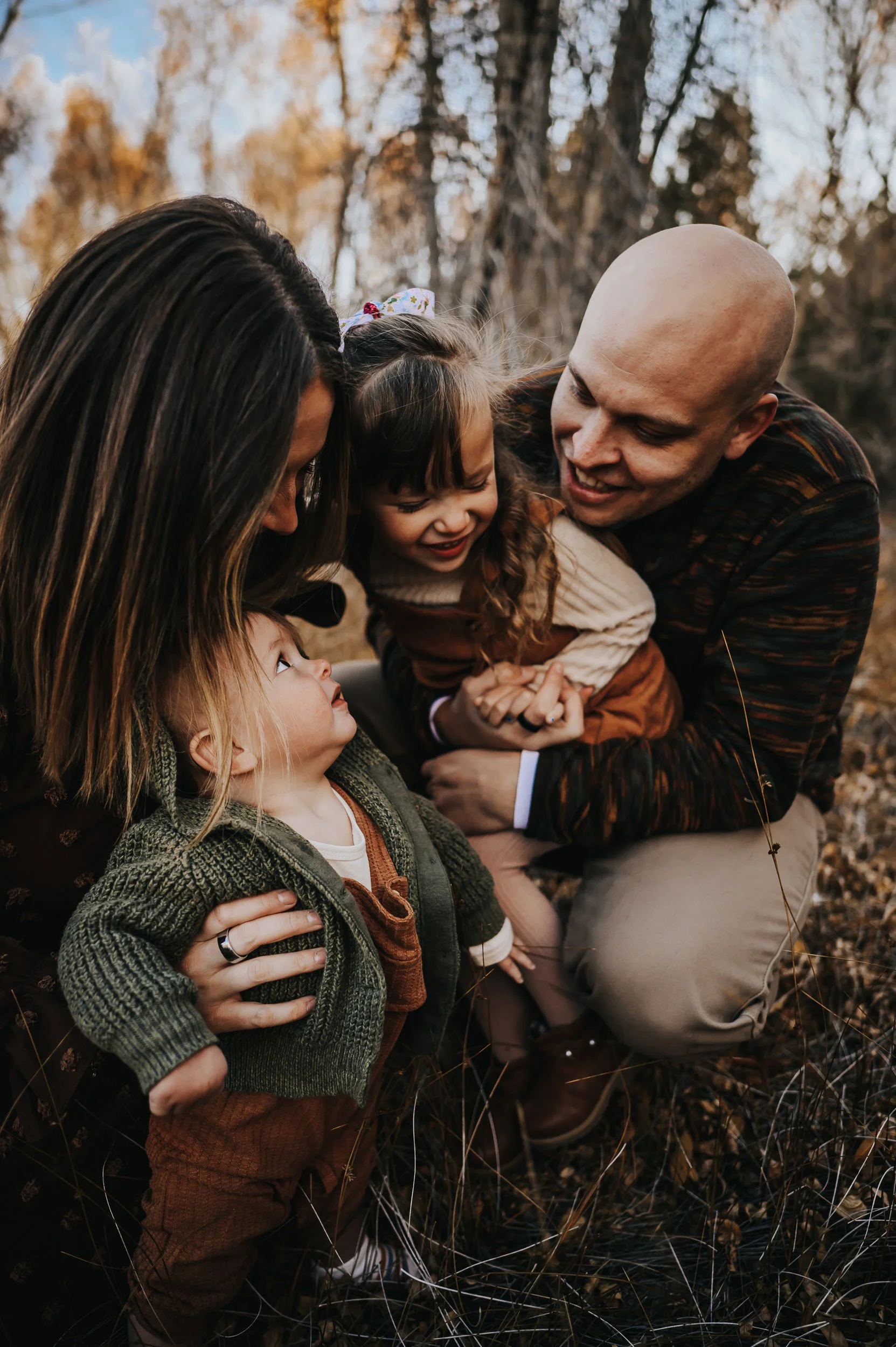
Fall in Colorado
Fall is peak season for family photography in Colorado, and for good reason. The aspens turn gold. The grasses go amber. The light is warm and low, and everything glows.
This is the season for rich, saturated color.
Best fall colors
Rust and burnt orange — the quintessential fall tones
Burgundy and wine — deep, romantic, stunning against gold aspens
Mustard and golden yellow — warm but be careful not to match the aspens too closely
Deep green — forest, olive, emerald
Cream and ivory — grounds warmer tones
Navy — a cooler anchor that balances all the warmth
Plum and mauve — unexpected but beautiful
Fall palette example
Burgundy dress (mom), olive sweater and brown pants (dad), mustard dress (daughter), cream knit romper (baby), rust cardigan layered on mom
What to avoid in fall
Bright orange, you'll blend into the aspens
Neon yellow, too harsh against golden tones
Pale, washed-out colors, they get lost in the richness of the season
Bright white, cream works much better
Winter in Colorado
Winter can be stunning, snow on the peaks, frosted grasses, soft gray light. But the landscape is neutral, which means your outfit does more of the visual work.
Best winter colors
Deep jewel tones — emerald, burgundy, sapphire, plum
Cream and ivory — but not in the snow (you'll disappear)
Rich neutrals — camel, chocolate brown, charcoal
Navy — classic, grounded, photographs beautifully
Rust and burnt orange — adds warmth to cold landscapes
Winter palette example
Emerald dress (mom), charcoal sweater and brown pants (dad), cream dress with burgundy cardigan (daughter), navy onesie (baby)
What to avoid in winter
Bright white or cream in the snow, you'll vanish
Pale grays and tans, they'll blend into bare trees and dead grass
Anything too light or summery, it'll feel disconnected from the season
Colorado locations and what colors work best
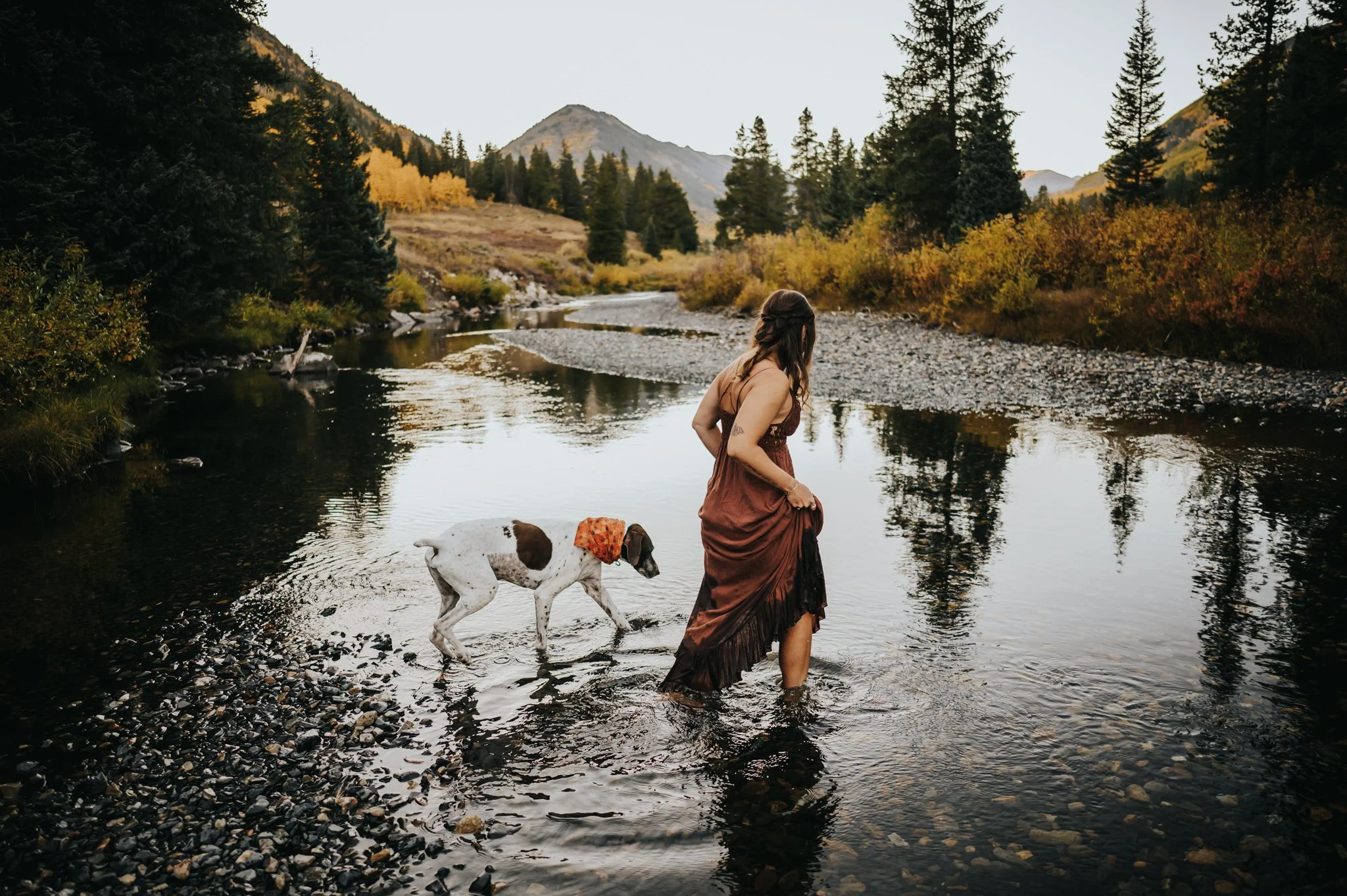
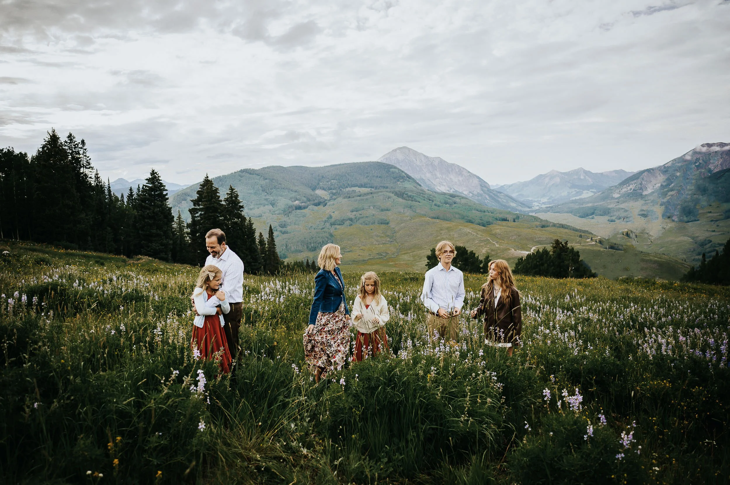
Mountain meadows and alpine locations
The high country is green in summer, golden in fall, and white in winter. The backdrop changes, but the principle stays the same: choose colors that complement without blending in.
Summer: Earth tones, creams, dusty blues, deeper greens Fall: Burgundy, rust, forest green, cream, navy Winter: Jewel tones, rich neutrals, deep greens
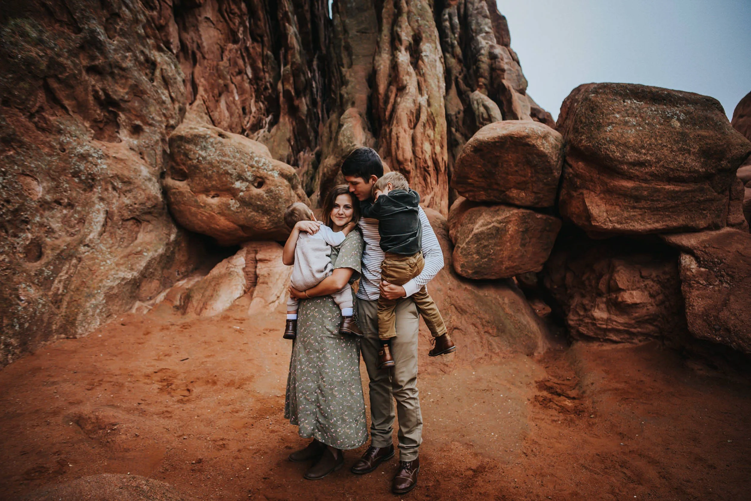
Red rocks (Garden of the Gods, Red Rocks Park, etc.)
Red rocks are warm and orange-toned. Cool colors create beautiful contrast.
Best colors: Navy, forest green, dusty blue, ivory, cream, deep teal, plum
Avoid: Red, orange, rust, mustard, you'll blend into the rock
Golden fields and grasslands
In late summer and fall, Colorado's grasses turn gold. This is gorgeous, but tricky, too many warm tones and you'll disappear.
Best colors: Deep green, burgundy, navy, cream, dusty blue
Avoid: Tan, mustard, golden yellow, you'll match the grass
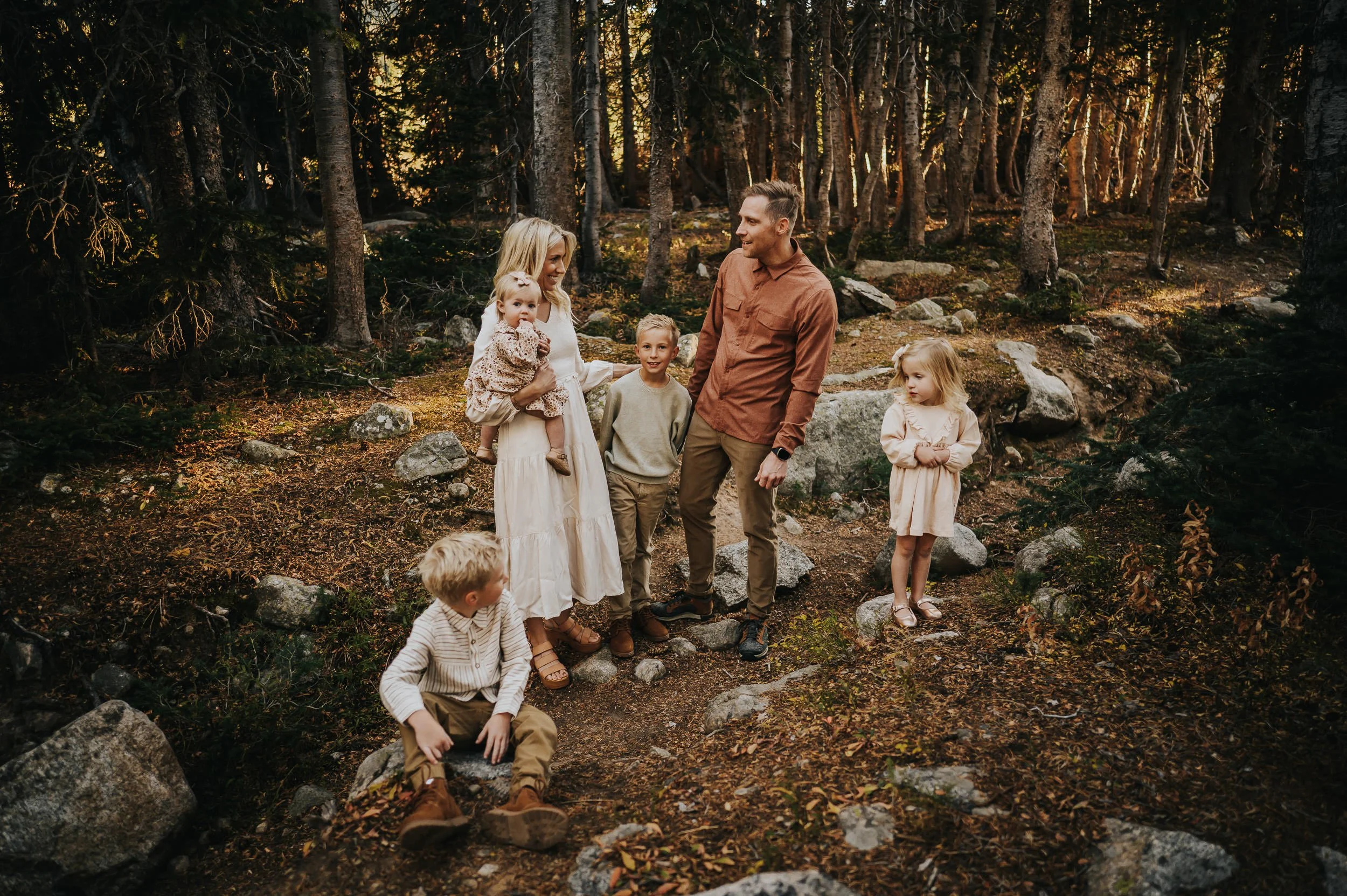
Evergreen forests
Dark green trees create a moody, rich backdrop. Lighter and contrasting colors pop beautifully.
Best colors: Cream, ivory, dusty rose, dusty blue, burgundy, rust
Avoid: Forest green head-to-toe, you'll blend in
Snowy landscapes
Snow is bright and reflective. You need color to stand out.
Best colors: Jewel tones (emerald, burgundy, sapphire), rich neutrals (camel, charcoal), navy
Avoid: Bright white, pale gray, anything too light
What colors to avoid (and why)
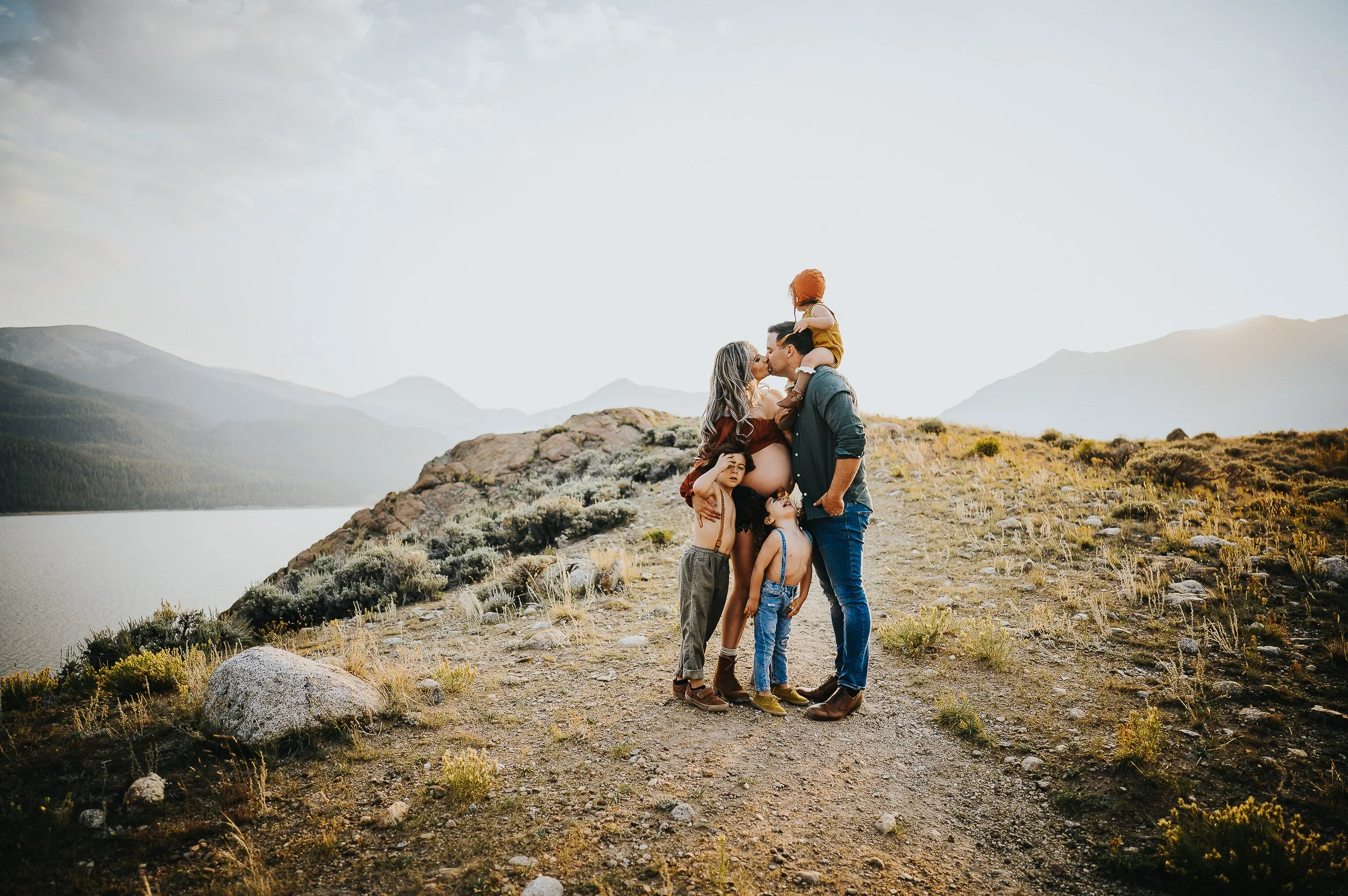
Hint: It’s not the color play this maternity family session had going for it, which was absolutely perfect.
Neon anything Neon colors cast unflattering light onto skin and pull focus from faces. They look harsh in natural settings.
Matching the landscape too closely This is the most common mistake. If the background is golden, don't wear gold. If the rocks are red, don't wear rust. You want to complement the landscape, not disappear into it.
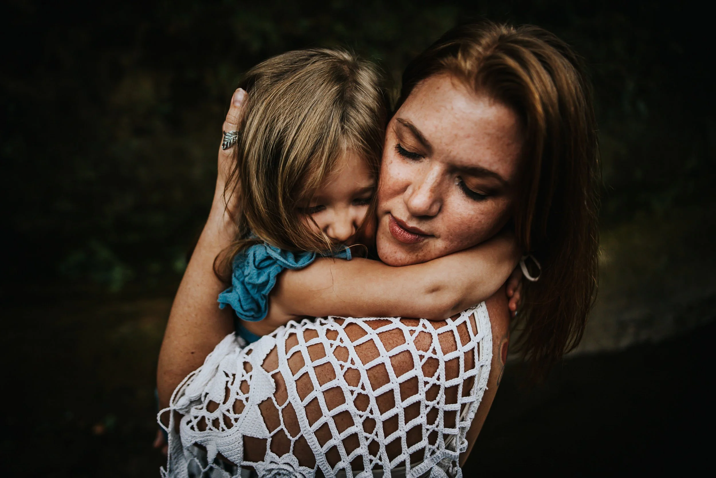
All black Black absorbs light and loses detail in shadows. It can look heavier in photographs than it does in person. Use black as an accent, boots, a jacket, not a full outfit.
Bright white Bright white overexposes easily, especially in direct sunlight or snow. Cream and ivory are much more forgiving and photograph beautifully. When in doubt, choose cream.
Trendy colors that won't age well Hot pink. Electric blue. Whatever's on the runways right now. Your photos should feel timeless. Choose colors that will still look beautiful in ten years.
Coordinating colors across your family
You don't need everyone in the same color. You need everyone in the same palette.
Start with an anchor piece, usually mom's dress, and pull colors from it for everyone else. Build a palette of 3-5 complementary tones and distribute them across the family.
For a deeper dive into building a coordinated palette, check out my post on how to coordinate family outfits that feel natural.
Let me help you choose
If you're still unsure what colors will work for your session, I've got you. I offer wardrobe styling guidance to all my Wild Prairie Photography clients. Tell me where we're shooting, what season, and what you're considering, and I'll help you build a palette that photographs beautifully.
For a complete overview of what to wear, including fabric, texture, and specific tips for moms, dads, and kids, read my full guide to what to wear for family photos in Colorado.
Ready to book your Colorado family session?
Now that you know what to wear, the only thing left is to show up. Let's find the perfect location, nail the timing, and spend an evening just being your family.
The photos will take care of themselves.